30 October 2014

The Genius and Madness of Fountain Pen Filling Systems

Visit Fountain Pen Network or a host of other fountain pen related websites and you'll see a host of reviews. Many of these break things down into various categories and then offer scores for each. One of these categories is, invariably, the filling system of the pen. This perhaps made sense some time in the distant past when a bevy of different filling systems, sometimes of wildly differing reliability, dotted the landscape. But those days are long gone. Among new pens, Roughly 95%, or perhaps even more, filling systems are cartridge/converter with the remaining 4% piston and a holdout few throwbacks like aerometric or lever filler. Yet this category remains obligatory, bizarrely being granted equal weight with things like writing quality.

Despite having decisively won the battle of the filling systems, cartridge/converters are often viewed with scorn, seen as decidedly second rate compared to pistons. This, to my mind, represents the steampunk sensibilities of those of us enamored of these objects. We like the 19th century clockwork of the screw gear and having a (relatively) hefty knob to turn to fill our pens. We like the decidedly unwelcoming (at least for newcomers) requirement to fill from a bottle, possibly dirtying our hands and much else besides. Cartridges, despite their portability, cleanliness, and ease, are to be scorned. The piston and the bottle are king. At least for westerners.

It is curious how cultural filling systems seem to be. The apparently ever-practical Japanese recognize sense when they see it (at least in this area), and are c/c fillers, even for the most expensive pens.

The Germans, masters of finely machined parts to infinitesimal tolerances, still favor pistons on more expensive entries, but economize lower down. This, however, seems to be changing. The Pelikan 200, most people's first encounter with the piston, now offers c/c as an option. Montblanc seems to be heading more and more in this direction as well.

Like much of the rest of Italy, there is a sharp divide between north, where pistons still hold some sway thanks to Aurora, and south, solid c/c territory. This division between the Teutonic and Mediterranean cultures spills over into France, solid c/c territory, even for top of the line pens like the Edson.

China, that vast factory of a country, seems divided between c/c and, bizarrely, aerometric. The latter seems an artifact of companies like Hero, where time has mostly stood still since the Communists took over in 1948. They happily churn out Parker 51 clones of varying quality using the same, state of the art in the 1950s technology, that vaulted Parker to the very pinnacle of pendom. Companies with newer plant seem to have gotten the memo about the virtues of c/c.

Even though filling systems have mainly converged on a single solution, they have not managed to converge on a single standard, nor will they, I think. The c/c solution won the day not just because it is technologically superior, but also because of its business potential. The claims of pen manufacturers not withstanding, any fountain pen ink will work in any pen. Waterman ink works perfectly well in Pelikans and vice-versa. But this 
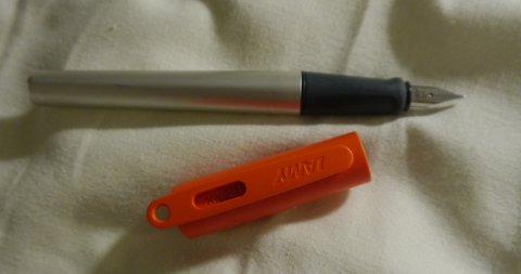
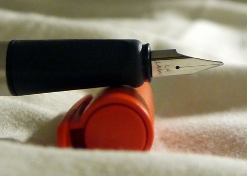
is not the case with cartridges. A Sheaffer cartridge is entirely useless in a Lamy.

The simple, humble cartridge is the 1960s antecedent to its more modern cousins sharing the name---inkjet cartridges and, even more recently, coffee cartridges. The idea is simple yet powerful. Once the consumer buys the durable product, the pen in this case, she is locked into buying branded cartridges for all eternity. Thus, the knockdown price of the Sheaffer No Nonsense pens offered in nearly every drugstore in the 1970s represented a gateway into the consumer's wallet via the odd shaped Sheaffer cartridges. The 
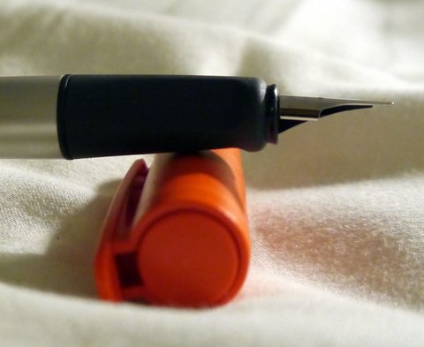
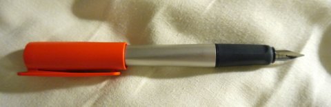
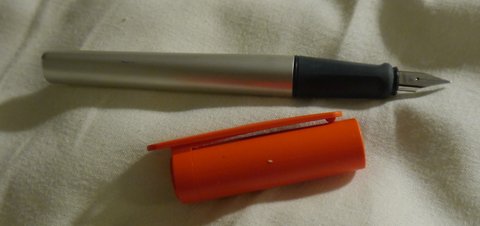
now ubiquitous Lamy Safari is the 2010s equivalent. At $35 or thereabouts, the Safari offers an exceptional deal. At $5 a pack, the ink does not. Such a strategy works, of course, only if you have a popular entry level pen to sell in volume. It's a nonsense if the products on offer are niche items.

This is reflected, somewhat, in the marketplace. A number of companies sell items that accommodate international sized cartridges, as close to a standard as there is likely to be. But these are not the companies whose bread and butter are "cheap and cheerful" pens for the masses. Consider a partial list of the two sides, proprietary and international:

Proprietary: Parker, Sheaffer, Cross, Lamy, Platinum
International: Waterman, Faber-Castell, Caran d'Ache, Pelikan

The outlier on the list is Pelikan. We they are mostly associated with high end products in the US, their place in the German market is entirely different. They still offer high end products there, but also do a lively school pen business. Indeed, some of my favorite knockabout pens are Pelikan school pens. For instance, the Pelikano is simply an outstanding pen, at least as good as the Safari, though far less well known. Why in heavens did Pelikan not adopt a proprietary strategy?

As a bottle user, the strategy utterly fails on me. Instead, it's simply annoying to have to buy a zillion different types of converters to fit pens that do not provide these. (Another clever, cost-effective and somewhat evil strategy to encourage customers to give up the bottle.)


To conclude my rant, let me make two points. First, it is silly to review a pen's filling system and use this as a basis for anything. If you abhor filling from a bottle, avoid pistons. Otherwise, it hardly matters. Second, if you are a slave to cartridges, you might want to reconsider. Not only do you get a lot more pretty colors from bottles, you save yourself from becoming Lamy's, or someone else's milk cow. 

24 October 2014

The greatest mechanical pencil ever made

When I was in grad school, I came to rely on mechanical pencils, almost exclusively, for notetaking. My time was the era before PowerPoint, before professors could professionally typeset their notes on a laptop. In short, it was a time when notetaking was king. The shift marked a profound change for me. I was a fountain pen guy through and through while working as a consultant. I loved the flair of being able to match the partners in the firm on at least one dimension. Sure, my suits were not as tailored (nor expensive), my shirts did not have my initials monogrammed on the cuffs, my ties were often bought from the streets of NYC's downtown rather than from some upscale store. But despite all this, my pens were in the big leagues--Montblanc 146, Pelikan M800, Parker Sonnet and Duofold.

Until grad school, that is, when I put my pens aside for a spell of about 4 years. The reason was simple enough. Taking notes produced mistakes, sometimes quite serious ones. I viewed my books of notes as fairly essential pieces of equipment to carry with me into life as an academic economist, and I wanted to be damned sure that they were not filled with cross-outs, scribblings, and so on. In principle, I could have viewed my in class notes as a kind of first draft, to be recopied and corrected subsequently. But I was far too lazy and too bored by the prospect to consider such a task. I was happy enough to make corrections, but a complete rewriting was beyond my tolerance. So I made the switch.

When using mechanical pencils all the time, you quickly discover their strengths and their limitations. For note taking, they are a major upgrade over the old fashioned wood cased pencils. Not having to sharpen and having a point of a consistent, and thin, width are admirable features. Sure, lead breakage could be an issue, but I learned to preload my pencils, to carry spares, and to not write so hard that breakage was an issue.

So what's not to like? As it turns out, those much vaunted thin, consistent points are more myth than reality. Unless you continually rotate the pencil during use, it develops a flat spot. Thus, what should be a crisp 0.5mm line becomes a drab, somewhat lighter 0.6 or 0.7mm line. Until you remember to rotate at which point it returns, for a time, to its former glory. The other weakness, the tendency to smudge and fade, simply goes with the territory. I still have these old notebooks only now, almost 20 years later, they are considerably more difficult to read.

It is the first weakness, however, that brings me to the greatest mechanical pencil ever made: The Uni-ball Kuru-toga. To put this claim in context, it is important to know that I love writing and drawing instruments, so I've tried many, many mechanical pencils. Of those I tried, the Lamy 2000 and Rotring 600/800 are some of the nicest, at least ergonomically. But given the choice, I'll take the Kuru-toga every time. It's secret is actually a very small thing: Every time you lift the pencil, the lead rotates a tiny bit. Indeed, the rotation is so small as to be virtually imperceptible and, given this, you might doubt that this would have much effect. But you'd be wrong. Unlike every other mechanical pencil in existence, the Kuru-toga ensures that you'll have a sharp 0.5mm point all the time (or 0.3, 0.7,,or 0.9 as strikes your fancy). No rotating, twisting, or even awareness is required. Moreover, this is no small benefit. Comparing the writing quality of my beloved Lamy 2000 side by side with the Kuru-toga, it is simply no contest--the latter looks much cleaner and nicer.

Now, there is one caveat: Those of you capable of endless, flowing cursive, or perfect Palmer method loops with each letter beautifully connection to the last are out of luck. The K-T only twists when you lift the pencil, and the lifts under this writing style are simply too infrequent to have much of an effect. This is not to say that only ball and stick people can get the pencil to work. I write in a kind of cursive italic writing, so some letters are connected while others, like the letter "r", are not. Even so, the system works perfectly.

Better still, a Kuru-toga is cheaper, much cheaper, than a Dr. Grip or a number of other blister pack pencils meant for the more discriminating masses. It typically runs $5 at Staples though I've gotten copies for only around $3 from time to time. Online prices are similar. In the US, it comes in a very business like chrome and translucent plastic. In Japan, however, you can obtain themed versions of the K-T, including such favorites as Hello Kitty and various superheroes. These cost a bit more, about $1 or so, than their more boring cousins.

So give it a go. At $5, there is little too lose and much to gain.

29 January 2014

Julius Caesar

Julius Caesar is a great man. He invented a fast food chain with a delightful orange flavored drink called Orange Julius. He also invented the salad and named it after himself, calling it the Caesar salad. Julius Caesar is named after the great Philadelphia 76ers basketball legend Julius Erving. Like Erving, Caesar was often called "Dr. J" by his friends.

13 November 2013

Why can't most people draw?

On flying back from Vancouver recently, I began sketching and coloring a colored pencil drawing of a daisy I had been working on. I was amazed at the reaction. Many people confessed that they could not draw at all and were amazed at my talent. This is not uncommon. I have similar experiences whenever I draw in public.

But here's a confession: I'm not all that good at drawing myself. By that I mean that I don't have any natural gift for drawing. If I do something good, it comes from patience, lots of erasing, and an openness to improve even when early efforts are unpromising. Most of all, though, whatever skill I have comes from a willingness to draw what I see, rather than what I think I see. The distinction is important and forms the thesis for this short essay.

Semiotics is an obscure academic subject mostly hiding as an even more obscure subfield of philosophy. Formally, it is the study of symbol. Despite its obscure position in academia and even more obscure position in society at large, the ability of humans to translate the particular into symbols is one of mankind's most important achievements. Obviously, the main use of language is to communicate, but what, exactly, does it mean to communicate? In essence, communication is the translation of subjective and particular experience into symbols permitting someone not experiencing the same thing, event, time, or place to relate to the experiences of the communicator. This relies on the use of symbolism, the translation of the particular into the general.

Thus, when I mention to you that the airplane seats were uncomfortable during my flight from Portland to Oakland, you, the reader, cannot know exactly what my seat felt like, nor its color, nor whether it's unsuitability mainly stemmed from inadequate back support compared with a lumpy cushion, but you can know, in general terms, the sensation of an uncomfortable seat. You, dear reader, have probably experienced such seats too. The broader point is that my language translated the particular experience, an uncomfortable seat on a flight from Portland to Oakland, into a set of general symbols recognizable to those not having had my specific experience. Mathematics is the same sort of ingenious creation, translating a specific experience of number into a general experience.

In large part, our maturity is measured by our ability to skillfully manipulate symbols in deriving ever more general associations between what we experience and what might be related to society as a whole.

So what does this have to do with drawing? Essentially, we do the same thing as we mature in our drawings, replacing the specific for general "formulae" for drawing hills, houses, the sun, people, and so on. For a period in our lives, this generalization is quite satisfying. The transition from constructing, from scratch, images of Mom, Dad, sister, brother, house, dog to drawing such images from prescribed formula, is seen by most children as an accomplishment, an advance.

But then problems arise. Unlike most aspects of life, where generality is a goal to strive for, symbols, generalities, are the great enemy of art. We do not wish to draw a generic or symbolic chair, but rather this chair on which we as currently seated. We do not wish to draw a generic girl, but rather the girl sitting across from us on the train.  Art, particularly in the formative adolescent years, is about the particular rather than the general, and here the conflict lies.

Having worked hard at and been rewarded for effective symbolism, it seems natural to turn to this technique in drawing as well.  But this does not produce a picture of THAT chair, only a picture of a generic chair from a generic angle. Thus, fundamentally, the production of art is about ungeneralizing, drawing the specific rather than the general drawing what you see, even if, for the momentm it looks terribly wrong compared to its symbol.

Ultimately, it is this conflict, between the symbol and the specific, that makes art so difficult. At a deep level, it's a totally unfamiliar exercise.


19 September 2013

Tombow Dual Brush Markers

Image source: Tombow USA
These markers are amazing. Not only are they fabulous as markers, but they are also the world's most precise and vibrant set of watercolors. The real beauty of Tombow markers is that, once you've laid down a line, you can easily brush it out to create a smooth gradient field. Gradient fields are critical to effective shading, and producing smooth ones is not always an easy task. It is with these markers.

A useful basis for comparison are Lyra Aqua-Brush markers. These feature nice, bright colors and smooth coverage, but are not nearly so friendly to being painted once laid down. With Lyras, you have to choose between using them as a marker, or treating them as paints and applying the ink to a palettes for subsequent brush application. Thus, these are inferior both in terms of accuracy and ease of use of the Tombows.

Recommendation: Strong Buy

Pilot 78g Review

Image source: Analog-dog.blogspot.com

This is a long-term review meaning that it is based on roughly 18 months experience with the particular pen. 

Pilot 78g Broad (stub):

After enjoying playing with my 1.1mm Lamy Joy, I thought it would be nice to add some other italic pens to my collection. The Lamy 1.1mm nib is smooth and pleasant to write with, but lacks sharp line variation and is, perhaps, a touch too broad for extensive notetaking. Based on my experience with Japanese nibs running thinner than western, I gambled that the Pilot 78g might serve this purpose better. So I bought a green one from Speerbob (great eBay seller, no affiliation) for $20 hoping that I would be happy. The pen arrived in a Pilot labeled cardboard box enclosed in a ziploc bag, also labeled Pilot. This is about what I was expecting, so I was not fussed by the utilitarian packaging. The pen did not come with a cartridge but did come with a Con-20 converter--a very nice touch for a pen at this price point. The Con-20, as most know, is not one of the better converters on the market, but it works well enough. 

Rant: Why are western pen companies so stingy with converters? It drives me nuts that when I buy a Safari, Vista, or Joy I have to plunk down an extra $6 for a converter--more than the cost of many Chinese pens that come with converters. To me, a converter is an essential part of the pen. I want to use bottled ink and that requires a converter. It's like selling a car and not including headlights since, after all, you don't have to drive at night. Lamy is not the only company guilty of this. Pelikan provides no converters for their inexpensive pens, nor does Parker or Sheaffer. The worst offender is Cross: I recently bought their Special Edition Year of the Dragon pen. It's a beautiful pen and not especially cheap, but they didn't bother to include a converter!! 
End of Rant

The moment of truth--inking the pen up and taking it for its maiden voyage--was something to look forward to. I filled it with Pelikan Konigsblau and gave it a go. The 78g broad is a wonderful pen. It produced a finer line than the 1.1mm Lamy and good variation. Smooth and effortless to use, it is a medium writer in terms of wetness and worked well for the cursive italic style that I favor. (Thank goodness for the Dubay and Getty book Write Now that taught me how to do this as my previous handwriting was spectacularly awful.) I also tried out foundational and half-uncial with good results as well.

What I want out of italic pens is the ability to use them to liven up my everyday handwriting. This means they must work when writing at speed, and they cannot be too fussy about the location of the sweet spot nor too sharp that paper gets torn when writing quickly. In those terms, the 78g is masterful. Of course, the compromise is that the thin part of the line is not as thin as what one can achieve with dip pen nibs nor are the wedge serifs in half-uncial as crisp as they might be, but for someone looking to pretty up their basic handwriting, it is excellent. 

This pen took its place in the #1 slot of my travel rotation. These pens live in a small case in my backpack and travel with me wherever I go. To be effective in this role, a pen needs to be cheap enough that it can be replaced if lost, which occasionally happens. It needs to be tough enough to get bounced around. It also needs to be continent enough that it does not leak when jostled. An ideal pen for the role should also be able to fly without problems. The 78g has performed well in all of these dimensions. It does not leak when jostled and flies extremely well--I've never had an ink explosion while flying with it many times and at various levels of fullness. It does, however, have one drawback for traveling: because it uses proprietary Pilot cartridges, it requires its own supply of cartridges for long trips apart from the usual supply of international carts I regularly carry.

Having used the pen for more than a year, it has acquitted itself extremely well. No signs of surface wear or other problems. The plating is still fine both on the furniture and on the nib itself. No functional problems with the nib or converter despite active use of both. The pen shows no tendency to dry out or become a hard starter even with weeklong periods of lack of use. 

For $20, the pen is an exceptional value for those looking for an easygoing italic/stub nib and some modicum of classiness. Cheaper italics, including the Pilot Pluminix can be had, though the weird shape and design of the Pluminix make it questionable for business use. The biggest drawback will be felt by those looking for extreme line variation, say running from EF to BBB. The 78g cannot supply this variation--it is more like F to BB (i.e. a stub). For those looking for the ultimate in fit and finish, the pen will also disappoint. The plastic is neither the most lustrous nor the highest grade. The furniture is functional but not spectacular. At its core, it is a utilitarian pen, comparable to the Lamy Safari and the like. Finally, for those who want their pens to have heft, it will disappoint, The all light-plastic construction makes the pen feather light. I find this to be perfectly fine and, indeed, a design plus for long writing sessions without fatigue. But others may prefer something a bit heavier. 

Recommendation: Strong Buy

Lamy Nexx

P1110006.JPG

I recently picked up a Lamy Nexx while traveling through the Netherlands. The Nexx seems to a a substitute for those who do not like the Safari. It costs about the same and has, perhaps, a slightly younger vibe to it. Two things led me to buy it. First, it had a bright orange cap, the official color of the Netherlands, so I thought it would be a nice memory. Second, it features a left handed nib and, being a lefty, I'm a sucker for such things.

P1100999.JPG

The pen has the usual solid Lamy construction. The body of the pen features brushed aluminum. It looks like the same material as the Al Star. While it looks lovely now, the Al Star was definitely prone to scratches and marks. We'll see how the Nexx does in that department. Stay tuned here for updates.

There is a thick ABS plastic liner beneath its aluminum outer skin. The section is made from solid plastic, but there it has more of a rubbery feel, like there is a bit of cushioning. Overall, it is much improved over the Safari. The cap is made from thick, bendable plastic. It has the peculiar feature. that the clip extends above the top of the cap and has an open ring. I presume this is so you could attach the pen to a lanyard of some sort and carry it around that way. All of these parts seem pretty close to unbreakable. 

 P1110004.JPG

The pen also has various self-preservation features to prevent it from rolling off of surfaces. The clip on the cap sticks out far enough that the cap will not roll. The body of the pen is triangular, so it too will not roll. Finally, the cap seems very securely attached to the body though it does not require excessive force to uncap the pen. I rather doubt that the cap and pen will part company unintentionally. 

All of this is to say that the pen is amazingly functional. Lamy has clearly put a lot of thought into all the little things that can go wrong with owning a pen and using it hard on a daily basis. This pen is designed to withstand those rigors. Indeed, this may be the most thoughtfully designed pens that Lamy has produced.

One big issue many people have with the Safari is that it is "style challenged." It's not clear to me that the Nexx answers the call in that regard. The triangular brushed aluminum body is definitely a step up from the Safari, but I'm not sure the oversized plastic cap is going to be a crowd pleaser. If you appreciate design strongly influenced by the form follows function philosophy, the Nexx will be your cup of tea, but I suspect for many it will be too utilitarian. 

P1110003.JPG


The nib is identical to the Safari. My left-handed nib is annotated as LH. It works flawlessly, writing between a fine and a medium. It's smooth and perfect. There is no line variation, but a bit of shading is possible with the correct inks. No hesitation, skipping, hard-starting, etc. Just a good, solid nib. I'm not sure what makes it left-handed. According to the person in the store where i bought it, pen manufacturers routinely sharpen one side of each nib asymmetrically where the side depends on handedness. Supposedly, lefty nibs are sharpened on the opposite side. First, I have no idea what good sharpening a nib might do. Second, I've never heard of such a practice, so it might be pure BS. Is any of this true? 

Taken as a whole, I'm very happy with my Nexx. I like the utilitarian aesthetic and I definitely appreciate all of the user oriented touches of the pen. The left-handed nib works extremely well for me and produces a line that is just the right width, MF. I prefer it to my Safaris though this could have more to do with its newness than anything else. A key question is whether the Nexx has solved the marking and scratch prone nature of the aluminum surface of the Al Star with this foray. If so, the pen will, in my eyes, be superior in every way to a Safari. We'll simply have to wait and see. 

If you're in the market for a cheap, dependable pen that has many thoughtful design features, the Nexx is definitely something to check out. 

P1110007.JPG

Recommendation: Buy