On flying back from Vancouver recently, I began sketching and coloring a colored pencil drawing of a daisy I had been working on. I was amazed at the reaction. Many people confessed that they could not draw at all and were amazed at my talent. This is not uncommon. I have similar experiences whenever I draw in public.
But here's a confession: I'm not all that good at drawing myself. By that I mean that I don't have any natural gift for drawing. If I do something good, it comes from patience, lots of erasing, and an openness to improve even when early efforts are unpromising. Most of all, though, whatever skill I have comes from a willingness to draw what I see, rather than what I think I see. The distinction is important and forms the thesis for this short essay.
Semiotics is an obscure academic subject mostly hiding as an even more obscure subfield of philosophy. Formally, it is the study of symbol. Despite its obscure position in academia and even more obscure position in society at large, the ability of humans to translate the particular into symbols is one of mankind's most important achievements. Obviously, the main use of language is to communicate, but what, exactly, does it mean to communicate? In essence, communication is the translation of subjective and particular experience into symbols permitting someone not experiencing the same thing, event, time, or place to relate to the experiences of the communicator. This relies on the use of symbolism, the translation of the particular into the general.
Thus, when I mention to you that the airplane seats were uncomfortable during my flight from Portland to Oakland, you, the reader, cannot know exactly what my seat felt like, nor its color, nor whether it's unsuitability mainly stemmed from inadequate back support compared with a lumpy cushion, but you can know, in general terms, the sensation of an uncomfortable seat. You, dear reader, have probably experienced such seats too. The broader point is that my language translated the particular experience, an uncomfortable seat on a flight from Portland to Oakland, into a set of general symbols recognizable to those not having had my specific experience. Mathematics is the same sort of ingenious creation, translating a specific experience of number into a general experience.
In large part, our maturity is measured by our ability to skillfully manipulate symbols in deriving ever more general associations between what we experience and what might be related to society as a whole.
So what does this have to do with drawing? Essentially, we do the same thing as we mature in our drawings, replacing the specific for general "formulae" for drawing hills, houses, the sun, people, and so on. For a period in our lives, this generalization is quite satisfying. The transition from constructing, from scratch, images of Mom, Dad, sister, brother, house, dog to drawing such images from prescribed formula, is seen by most children as an accomplishment, an advance.
But then problems arise. Unlike most aspects of life, where generality is a goal to strive for, symbols, generalities, are the great enemy of art. We do not wish to draw a generic or symbolic chair, but rather this chair on which we as currently seated. We do not wish to draw a generic girl, but rather the girl sitting across from us on the train. Art, particularly in the formative adolescent years, is about the particular rather than the general, and here the conflict lies.
Having worked hard at and been rewarded for effective symbolism, it seems natural to turn to this technique in drawing as well. But this does not produce a picture of THAT chair, only a picture of a generic chair from a generic angle. Thus, fundamentally, the production of art is about ungeneralizing, drawing the specific rather than the general drawing what you see, even if, for the momentm it looks terribly wrong compared to its symbol.
Ultimately, it is this conflict, between the symbol and the specific, that makes art so difficult. At a deep level, it's a totally unfamiliar exercise.
13 November 2013
19 September 2013
Tombow Dual Brush Markers
 |
| Image source: Tombow USA |
A useful basis for comparison are Lyra Aqua-Brush markers. These feature nice, bright colors and smooth coverage, but are not nearly so friendly to being painted once laid down. With Lyras, you have to choose between using them as a marker, or treating them as paints and applying the ink to a palettes for subsequent brush application. Thus, these are inferior both in terms of accuracy and ease of use of the Tombows.
Recommendation: Strong Buy
Pilot 78g Review
 |
| Image source: Analog-dog.blogspot.com |
This is a long-term review meaning that it is based on roughly 18 months experience with the particular pen.
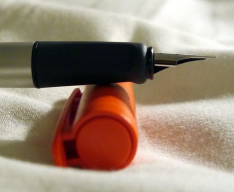
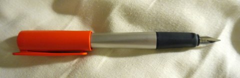
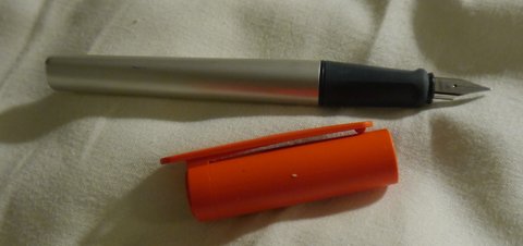
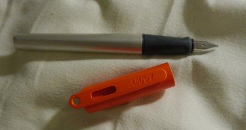
Pilot 78g Broad (stub):
After enjoying playing with my 1.1mm Lamy Joy, I thought it would be nice to add some other italic pens to my collection. The Lamy 1.1mm nib is smooth and pleasant to write with, but lacks sharp line variation and is, perhaps, a touch too broad for extensive notetaking. Based on my experience with Japanese nibs running thinner than western, I gambled that the Pilot 78g might serve this purpose better. So I bought a green one from Speerbob (great eBay seller, no affiliation) for $20 hoping that I would be happy. The pen arrived in a Pilot labeled cardboard box enclosed in a ziploc bag, also labeled Pilot. This is about what I was expecting, so I was not fussed by the utilitarian packaging. The pen did not come with a cartridge but did come with a Con-20 converter--a very nice touch for a pen at this price point. The Con-20, as most know, is not one of the better converters on the market, but it works well enough.
Rant: Why are western pen companies so stingy with converters? It drives me nuts that when I buy a Safari, Vista, or Joy I have to plunk down an extra $6 for a converter--more than the cost of many Chinese pens that come with converters. To me, a converter is an essential part of the pen. I want to use bottled ink and that requires a converter. It's like selling a car and not including headlights since, after all, you don't have to drive at night. Lamy is not the only company guilty of this. Pelikan provides no converters for their inexpensive pens, nor does Parker or Sheaffer. The worst offender is Cross: I recently bought their Special Edition Year of the Dragon pen. It's a beautiful pen and not especially cheap, but they didn't bother to include a converter!!
End of Rant
The moment of truth--inking the pen up and taking it for its maiden voyage--was something to look forward to. I filled it with Pelikan Konigsblau and gave it a go. The 78g broad is a wonderful pen. It produced a finer line than the 1.1mm Lamy and good variation. Smooth and effortless to use, it is a medium writer in terms of wetness and worked well for the cursive italic style that I favor. (Thank goodness for the Dubay and Getty book Write Now that taught me how to do this as my previous handwriting was spectacularly awful.) I also tried out foundational and half-uncial with good results as well.
What I want out of italic pens is the ability to use them to liven up my everyday handwriting. This means they must work when writing at speed, and they cannot be too fussy about the location of the sweet spot nor too sharp that paper gets torn when writing quickly. In those terms, the 78g is masterful. Of course, the compromise is that the thin part of the line is not as thin as what one can achieve with dip pen nibs nor are the wedge serifs in half-uncial as crisp as they might be, but for someone looking to pretty up their basic handwriting, it is excellent.
This pen took its place in the #1 slot of my travel rotation. These pens live in a small case in my backpack and travel with me wherever I go. To be effective in this role, a pen needs to be cheap enough that it can be replaced if lost, which occasionally happens. It needs to be tough enough to get bounced around. It also needs to be continent enough that it does not leak when jostled. An ideal pen for the role should also be able to fly without problems. The 78g has performed well in all of these dimensions. It does not leak when jostled and flies extremely well--I've never had an ink explosion while flying with it many times and at various levels of fullness. It does, however, have one drawback for traveling: because it uses proprietary Pilot cartridges, it requires its own supply of cartridges for long trips apart from the usual supply of international carts I regularly carry.
Having used the pen for more than a year, it has acquitted itself extremely well. No signs of surface wear or other problems. The plating is still fine both on the furniture and on the nib itself. No functional problems with the nib or converter despite active use of both. The pen shows no tendency to dry out or become a hard starter even with weeklong periods of lack of use.
For $20, the pen is an exceptional value for those looking for an easygoing italic/stub nib and some modicum of classiness. Cheaper italics, including the Pilot Pluminix can be had, though the weird shape and design of the Pluminix make it questionable for business use. The biggest drawback will be felt by those looking for extreme line variation, say running from EF to BBB. The 78g cannot supply this variation--it is more like F to BB (i.e. a stub). For those looking for the ultimate in fit and finish, the pen will also disappoint. The plastic is neither the most lustrous nor the highest grade. The furniture is functional but not spectacular. At its core, it is a utilitarian pen, comparable to the Lamy Safari and the like. Finally, for those who want their pens to have heft, it will disappoint, The all light-plastic construction makes the pen feather light. I find this to be perfectly fine and, indeed, a design plus for long writing sessions without fatigue. But others may prefer something a bit heavier.
Recommendation: Strong Buy
Lamy Nexx
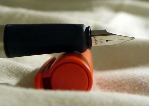
I recently picked up a Lamy Nexx while traveling through the Netherlands. The Nexx seems to a a substitute for those who do not like the Safari. It costs about the same and has, perhaps, a slightly younger vibe to it. Two things led me to buy it. First, it had a bright orange cap, the official color of the Netherlands, so I thought it would be a nice memory. Second, it features a left handed nib and, being a lefty, I'm a sucker for such things.
The pen has the usual solid Lamy construction. The body of the pen features brushed aluminum. It looks like the same material as the Al Star. While it looks lovely now, the Al Star was definitely prone to scratches and marks. We'll see how the Nexx does in that department. Stay tuned here for updates.
There is a thick ABS plastic liner beneath its aluminum outer skin. The section is made from solid plastic, but there it has more of a rubbery feel, like there is a bit of cushioning. Overall, it is much improved over the Safari. The cap is made from thick, bendable plastic. It has the peculiar feature. that the clip extends above the top of the cap and has an open ring. I presume this is so you could attach the pen to a lanyard of some sort and carry it around that way. All of these parts seem pretty close to unbreakable.
The pen also has various self-preservation features to prevent it from rolling off of surfaces. The clip on the cap sticks out far enough that the cap will not roll. The body of the pen is triangular, so it too will not roll. Finally, the cap seems very securely attached to the body though it does not require excessive force to uncap the pen. I rather doubt that the cap and pen will part company unintentionally.
All of this is to say that the pen is amazingly functional. Lamy has clearly put a lot of thought into all the little things that can go wrong with owning a pen and using it hard on a daily basis. This pen is designed to withstand those rigors. Indeed, this may be the most thoughtfully designed pens that Lamy has produced.
One big issue many people have with the Safari is that it is "style challenged." It's not clear to me that the Nexx answers the call in that regard. The triangular brushed aluminum body is definitely a step up from the Safari, but I'm not sure the oversized plastic cap is going to be a crowd pleaser. If you appreciate design strongly influenced by the form follows function philosophy, the Nexx will be your cup of tea, but I suspect for many it will be too utilitarian.
The nib is identical to the Safari. My left-handed nib is annotated as LH. It works flawlessly, writing between a fine and a medium. It's smooth and perfect. There is no line variation, but a bit of shading is possible with the correct inks. No hesitation, skipping, hard-starting, etc. Just a good, solid nib. I'm not sure what makes it left-handed. According to the person in the store where i bought it, pen manufacturers routinely sharpen one side of each nib asymmetrically where the side depends on handedness. Supposedly, lefty nibs are sharpened on the opposite side. First, I have no idea what good sharpening a nib might do. Second, I've never heard of such a practice, so it might be pure BS. Is any of this true?
Taken as a whole, I'm very happy with my Nexx. I like the utilitarian aesthetic and I definitely appreciate all of the user oriented touches of the pen. The left-handed nib works extremely well for me and produces a line that is just the right width, MF. I prefer it to my Safaris though this could have more to do with its newness than anything else. A key question is whether the Nexx has solved the marking and scratch prone nature of the aluminum surface of the Al Star with this foray. If so, the pen will, in my eyes, be superior in every way to a Safari. We'll simply have to wait and see.
If you're in the market for a cheap, dependable pen that has many thoughtful design features, the Nexx is definitely something to check out.
Recommendation: Buy
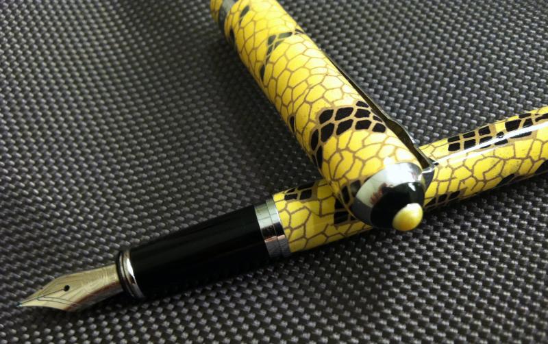
Duke/Uranus Snakeskin
About six months ago, I discovered the amazing treasure trove of cheap Chinese pens available on eBay. While suspicious of the quality on offer at such low prices, I thought it worth plunking down fifty bucks of fun money to find out. I had heard the Duke was one of the more reputable of the Chinese pen manufacturers, so I spent $7 of the Duke/Uranus snakeskin. At that time, the Pelikan Lizard had just come out and I wanted to compare the Chinese and Pelikan versions of lizard/snake scales. It goes without saying that, in all ways artistic, the Pelikan blows this pen away, so this review will only examine the pen on its own merits. I've now had the piece for six months and used it off and on during that time. It's been in various rotations three times, or about 6 weeks of reasonably intense usage.
The pen arrived in a nice blue Duke labeled gift box or approximately the same dimensions as a typical Waterman pen box. Inside, the pen was enclosed in a narrow plastic bag. It came with the converter pre-installed and, from first appearances, looked pretty good. Like most Chinese pens, this one features a brass body with a silk-screened pattern and then a clearcoat layer of varnish on top. The pen itself is of moderate weight, approximately that of a Sheaffer Prelude. It is a thin pen, but not obnoxiously so. A close inspection of the pattern reveals no disastrous defects, but the screening is certainly imprecise and incomplete in places. The design looks much better from a distance than up close, where the sloppy craftsmanship is more readily apparent.
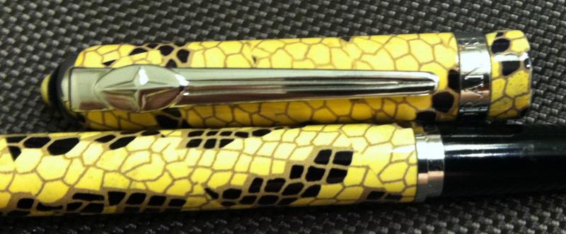
The pen does have some nifty features that elevate it somewhat. The cap band is handsomely inscribed "URANUS" in a Roman font, together with some stars and some Chinese script. Uranus is, I believe, a sub-brand of Duke. After 6 months, it has held its luster and looks quite nice. The clip features a lovely compass rose design, and the tassie features an ivory circle in a sea of black. These details are all well executed.
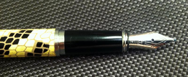
The nib is a nice design too, featuring a crown logo with rays splaying out toward the end of the nib. At the bottom is the word Duke inscribed in san serif all-caps. While the design elements are good, the craftsmanship of the stamping is less so as the imprint is weak. Holding the pen side by side with a Pilot 78g, the difference in the quality of the nib inscription is striking. All of this is to say that you do, to some extent, get what you pay for. A large part of the difference between a $100 pen and a $7 pen is in the quality of the materials and craftsmanship. I would say that, for the price, Duke has done a very creditable job on the design and execution.
The cap snaps on and off and posts securely. Many Chinese pens feature snap on/off caps, presumably for cost reasons, but getting the correct amount of force to hold the cap on seems to be a challenge for many. Most err on the side of way too much force. Baoer, in particular, seems to suffer from this problem a fair bit. Some, like certain Hero pens, employ too little force. Duke, however, has found the "butter zone" for the force needed with this cap. It's easy to remove, but does not remove itself. One also worries that, even if the force is correct initially, wear and use will lead to a situation where it's no good. After 6 months of use, however, there is no sign of any problem.
On to the writing. (See attached written review.)
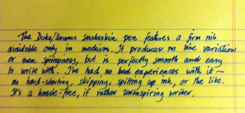
This pen is perfectly fine. I'm glad to have satisfied my curiosity about Chinese pens, but I do not see myself getting any more of them, at least at this price point. The $30 Kaigelu pens that are an homage (copy) to the Parker Duofold Centennial are rather nice, but these very inexpensive pens have to make too many sacrifices in the name of cost reduction to be inspiring. In a way, I'd prefer the more honest approach that Pilot and Sailor have taken with this market. The Platinum Preppy and Plumix cost about the same or less. They do not try to pretend to be a high-end pen, even from a distance. What they do well is to produce an interesting writing experience with a number of options. Duke/Uranus, on the other hand, provides a reliable writing experience, but not an interesting one.
I would recommend passing on these unless you are in the position of needing a reliable pen with a more upmarket (at least from a distance) design. Even then, I would say that springing for a Pilot 78g is probably still a better bet as these can be had for around $15.
Recommendation: Buy
Recommendation: Buy
18 September 2013
Cross Year of the Dragon Special Edition Fountain Pen
 |
| Image Source: Cloudofchaos |
Happily for those open-minded to the possibility, the result of both the mass market strategy and the lack of prestige appeal among pen people is that Cross fountain pens are quite inexpensive compared to others in the same tier. I picked up a new special edition Year of the Dragon fountain pen (in Chinese red, appropriately enough) for about $130 from an online seller.
Like many other special editions, Cross takes an existing model, in this case the Sauvage, and then modifies the design for the theme of the edition. This pen is lacquer over brass, so it is not a light pen, but it is not especially heavy either, even with the cap posted. It is well-balanced and not fatiguing.
(Rant: It drives me crazy that so many people consider the heft of a fountain pen a symbol of quality. Chinese manufacturers, especially, seemed to have picked up on this and sell mostly brass bodied designs that often weigh upwards of 30g, which is a ton for a writing implement. What's even worse is that the caps of many Chinese pens are made from solid brass, worsening the overall weight problem and destroying the possibility of using the cap posted. The otherwise lovely Kaigelu 316 suffers from this problem in spades. End of rant.)
As a writer, the Dragon performs extremely well, at least as well as others in its same class such as Parker Sonnets or Pelikan M400s. It is smooth, consistent, and responsive. The nib is stiff, but offers enough feedback to provide a good connection between the writer and the paper.
The biggest asset of the pen is its lovely design. The inlaid dragon pattern is gorgeous. Though not apparent from photos, there is a translucent diamond pattern of red on red in the body of the pen. This gives a 3 dimensional look to the design that is unique to this particular pen. The design also extends to presentation. The pen comes in a handsome red and black box with a thoughtfully created stand inside allowing you to display the pen with the box open.
I do have a quibble with Cross however. The pen does not come with an ink converter. This is truly ridiculous--converters cost little to manufacture (though the markup at the retail level is obnoxious, but that's another rant) and make a big difference to those wishing to use the pen with bottled ink. Not including such a thing simply looks tacky and undermines the overall presentation. It would be like purchasing a Lexus or BMW and having them tell you that it costs extra if you would like a radio in the car. Sure the car can be used without a radio, but one expects such "luxuries" when buying a high-end product.
Recommendation: Buy
General's Chalk Pastel Pencils
 |
| General's Pastel Chalk Pencils |
Initially, I did some simple toning exercises with the pencils, shading in spheres and the like. It takes a bit of work to get strong coverage with these guys, but the results are quite nice. Unlike colored pencil, smudging with a tortillon or finger produces nice, smooth gradient fields with little effort. The white was not as opaque as I might have wished, but this may merely be a property of the medium rather than a shortcoming in this particular pencil.
Naturally, this process blunted the tips of the pencils, so I was forced to resharpen. Using a Staedtler hand sharpener, I had no problems with the sanguine and white, but the brown immediately broke. Changing sharpeners and even going to sandpaper, I had the same experience over and over. I would almost get a decent point and then the whole thing would disintegrate from the base of the point. By the end, I had managed only a tiny point and lost about 75% of the pencil.
While I realize that pastel chalks are fragile, this behavior is completely ridiculous. Even though these pencils are cheaper than other brands, accounting for wastage from fragility makes them a far less good value for money. They are simply not interesting enough to put up with this sort of thing.
Recommendation: Hold
17 September 2013
Derwent Graphitint Pencils
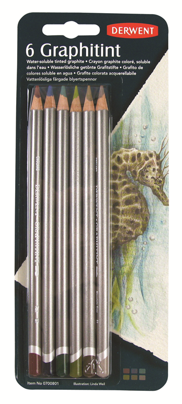 |
| Graphitint Blister Pack, linked from the Derwent website |
One of life's great pleasures is browsing around art stores. In my case, Richard's is the local mecca here in Walnut Creek, CA. Wandering the aisles recently, I ran across a blister pack of Derwent Graphitint pencils. These are a fascinating product consisting of graphite lightly tinted with color. While tinted graphite has been around forever, these pencils have a unique additional capability--they are water soluble.
Used dry, they are very good 4B sketching pencils. They sharpen to a good point and hold that point reasonably well, or at least as well as one might expect given the softness of the lead. Breakage has not been an issue at all for me. As advertised, the tint is very subtle, at least for most colors. The ivy is the exception, it looks more like a colored pencil than graphite. They make a nice range of tonal variation without exceptional effort and getting a smooth gradient of tone is not all that difficult. Their points are fine enough that they can be used for detail work although the softness of the lead cuts against this aspect since they dull quickly.
The excitement starts when you add water to the mix. I used the Sakura waterbrush that came with a Koi watercolor set while out sketching recently. What a transformation! A sketch of the Closter in Furstenfeldbruck (a town near Munich) went from a low key image to a riot of color and tone. Adding water also allows for a loose style. I found that I need not bother to worry about getting perfect coverage in my layering or getting an exactly smooth tone gradient. Instead, I loosely colored in different levels of tone and then relied on the brush to evenly layer and smooth the tones. Unlike working in colored pencil, the Graphitints have the advantage of easy erasing, no kneadable erasers or any other tricks are required to lift off stray color. A simple eraser does the trick.
Lately, I've taken to sketching using an ultralight art kit, everything fitting into a slim school pencil case, consisting of some graphic pencils, a set of graphitints, a Staedtler sharpener and eraser, and a black Micron 05 pen. This little kit can produce good stuff on anything from 70-140 lb Bristol or watercolor paper. The Graphitints do not require much water to spring to life, so you can always work relatively dry if using lighter paper. This little kit allows for a wide range of styles to fit your mood, everything from full-blown watercolor to pure pen and ink.
My only quibble is with the range of colors offered in the blister pack. Used dry, the dark green, dark brown, and gray pencils are almost identical in tone. Even wet, the gray pencil does not add much, better would be to have some lighter red-brown or orange-red tone in the mix since both the port and brown are rather too dark to capture certain red-orange-ochre values.
Overall recommendation: Strong buy.
Subscribe to:
Posts (Atom)